Press F5 to enter design mode in the Form view. To return to normal state press F5 again. In design mode click with the right mouse button and the following pop-up menu appears:
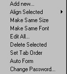
Pop-up menu in design mode in Form view
The easiest way to create a form from scratch is to select Auto Form or select Edit All� and then click Auto Form. Now you have the basis for your further refinement of the controls in the form view, see below.
Types of Controls
In Orbit Front you can use the following types of controls:
|
Control |
Description |
|
Static |
A read-only text. Used as header or caption.
|
|
Field |
A control linked to a field in the database. The type of the control is the same as the type of the field, e.g. boolean, text, number, etc.
|
|
Bitmap |
An imported or pasted bitmap.
|
|
Query Button |
A button linked to a query defined in the database.
|
|
Rectangle |
A rectangle. Used as a black line or a border
|
|
Static Field |
A read-only text linked to a text-field in the database.
|
|
Static Bool |
A read-only text (= a field caption) linked to a boolean-field in the database. If the value of the boolean field is true/yes, the caption of the boolean field will be shown, if it is false/no the field caption will not be shown. |
Definitions of Controls
If you double-click on a control or click with the right mouse button and select Add� a control definition dialog box will appear. The definition of a control depends on the type of the control. Below you'll find a table describing which settings are necessary for each type of control:
|
Control |
Settings |
Description |
|
Static |
Id Caption Font |
The read-only text
|
|
Field |
Id Bound to Read Only DistinctList
User List
Dynamic List
Print Font�
Input mask |
The linked field in the database The user can't edit the field value A combo box with available field values. If your database contains thousands of records please be aware that this facility will slow down the system. Will present the user with a list of possible values for a field. Enter your own list items by using the Setup� button. Will show a list where the contents change dependent on the values of selected fields of type long in the current record. The caption of the fields you have selected will be included in the list, if the value is greater than zero. The list will be sorted by the values in the field. The font used when printing the form view.
The input mask can be assigned to a field to help the user inputting the data in the right format. The desired format is defined by setting an input mask. The mask can contain any literal, non-mask character, which will be displayed. Special mask characters are used to denote input spots in the edit, based on the following key: See Table and examples below |
|
Bitmap |
Id Setup |
The dialog box where you import or paste the bitmap. |
|
Query Button |
Id Caption Bound to Query |
The button text. The linked query in the database. |
|
Rectangle |
Id |
|
|
Static Field |
Id Bound to Font |
The linked text field in the database
|
|
Static Bool |
Id Bound to Font |
The linked boolean field in the database |
|
Mask Character |
Input allowed for that field |
|
# |
Numeric data (0-9) |
|
A |
Alpha-numeric data (0-9 and a-Z) |
|
& |
Any ASCII character |
|
? |
Alphabetic data (a-Z) |
|
U |
Accepts a-Z, forces to A-Z (uppercase) |
|
L |
Accepts a-Z, forces to a-z (lowercase) |
|
\ |
Escape character. Use this character if you would like one of the above to be interpreted as a literal character (e.g., shown in the mask) |
Here are some examples of popular masks:
|
Name |
Mask |
Example |
|
Date |
##/##/## |
12/24/95 |
|
Time |
##:## UU |
12:35 AM |
|
Social Security Number |
###-##-#### |
148-92-1532 |
|
Phone |
(###) ###-#### [####] |
(919) 321-6186 7 |
|
Zip code + 4 |
#####-#### |
27858-1203 |
|
First Name |
???????????????? |
Bartholemew |
If you check the box Background Color the control will get the same background color as the form view. If you for instance want to indicate that the field is read-only you check the Read Only- and Background Color boxes and the field control will be displayed like a static control. Note that the Background Color box is disabled if the field uses a distinct-, dynamic- or user list.
If you want to divide the controls into several pages, you can for each control in the page edit box specify which page the control will be located in.
Moving Controls
You can move the controls either by selecting them first and move them with the mouse or by changing the co-ordinates in the Control Definition dialog.
Sizing Controls
You can change the size of a control either by selecting it first and then change the size with the mouse or by changing the co-ordinates in the Control Definition dialog.
If you want to change a set of controls to have the same size, select them and then select Make Same Size from the right-click pop-up menu. Please note that the selected control with the red color is the governing control for the size.
Aligning Controls
Select the controls and select Align Selected from the right-click pop-up menu. Decide if you want to align them to the left, right, top or bottom. Please note that the selected control with the red color is the governing control for the alignment.
Same Font
Select the controls and select Make Same Font from the right-click pop-up menu.
Deleting Controls
You can delete controls in one of two ways:
1. Select the control by clicking on it (Use the Shift key to select more), click with the right mouse button and select Delete Selected
2. Click with the right mouse button and select Edit All...In the dialog choose a control and click on Delete.
Tab Order
You can decide the tab order for the edit controls in the form view. You can either enter a number in the field Tab Order in each Control Definition dialog box or easier you can select Set Tab Order from the right-click pop-up menu and just click on the controls in the order you want. When you are satisfied with the tab order, select the menu item again to avoid displaying the tab order number in the controls.